Do you need a modular dashboard structure – or will something cheaper work?
Overview
Different dashboard structures can look superficially similar. The common purpose is to make viewing data easy – and intuitive. But the structures underneath what you see can make a huge difference to the future flexibility.
Explanation
There are many ways to structure a reporting solution.
Showing the results online is normal. A common model is shown in the diagram below.
There are 3 layers.
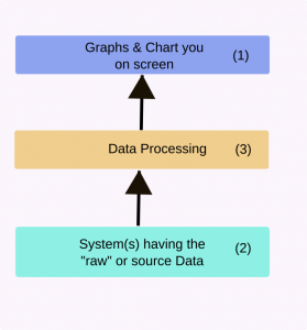
The first obvious layer is the screen that you see (layer 1). This “presents” the data to you. Lots of effort can be put into making this smart and easy to read.
In the middle is the “processing layer” (layer 3). The depth and complexity of this layer can vary enormously. We’ll come back to this in a minute.
Finally there are the systems that have the source data (layer 2). The data may be “raw”. That is not really suitable for human viewing without some serious processing.
Some dashboard marketing will emphasise the numbers of systems they can connect. This is a bit like never mind the quality feel the quantity. the reality is that each organisation wants the system to connect to “its” systems.
Connecting to systems in 2020 isn’t hard. And there are intermediaries like Funnel.io that have turned it into a business. So in reality the data can usually be extracted.
How much processing?
So sometimes the data is ready for viewing and needs little processing. Google Data Studio and many of the subscription cloud based platforms assume this. So in our diagram layer 3 would be thin or non-existent.
But you need to look carefully at the source data before accepting this assertion. It might be appropriate for analysts. It is rarely so for others. Managers for instance might need help with embedded jargon for instance.
“Zero processing” is rarely appropriate for anyone who isn’t an analyst. So the dashboard for analysts might miss out
More processing
But systems constructed for more in depth data processing vary. The structure and flexibility can vary widely.
Some will have an extensive library of functions that can be applied to any data item. This can sound impressive but fail to tackle some problems.
Suppose we want to name visitors as affiliate if the visitor arrived from an affiliated site. This is taking the value of one field (“where they came from”) and using it to overwrite another field (“visitor type”).
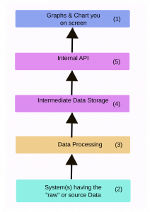
More flexible processing
The most flexible and capable processing system operate in a modular fashion. There is a data processing pipeline and the data can be progressively altered by each module. It is ideal if we can length the pipeline – and add new modules at will. Peregrine reporting uses this system.
Peregrine uses an extremely “post-processing” dashboard structure. It also adds a storage layer (4) and internal API (5). This minimises the wait time for viewers and makes the presentation more flexible.
Side Effects
This decision – to priorities data processing has some side effects.
Letting users edit the processing pipeline is a serious challenge. But it also assumes the user would want to configure a complex data processing pipeline. We decided that that pushed our users back towards being analysts. And that isn’t the type of user we see as benefiting most from peregrine. So it’s part of the service.
Smart Marketing Reports helps marketing agencies pitch and deliver measurable marketing. We believe:
- The full marketing potential of reporting isn’t used. This means marketing agencies sell less and lose clients earlier than they could.
- Raw Marketing Data normally needs cleaning and manipulating before it is fit to be shown to executives. So ongoing support is required.
- Self service cheap cloud based dashboards are rarely the best solution for ambitious agencies.
There are many reasons why. Discover more about our approach from the articles and thought leadership videos elsewhere on this site. And feel free to get in touch and have a chat.